Robbie Thain
Founder, CEO

Maximizing event lead conversion requires structured spatial viewing zones, precise typographic scaling, high-contrast visual hierarchies.

Trade show booth graphics are not decorative backdrops, wall art, or enlarged product brochures. They are a high-speed optical communication system engineered to capture qualified attention, communicate commercial value, and direct visitor behavior in high-friction environments. This guide details the spatial rules, typographic benchmarks, regulatory claim structures, and cross-channel workflows required to turn physical booth architecture into a measurable engine for enterprise pipeline.
High-performing trade show signage cuts through sensory noise to convey your core market positioning within three seconds. By aligning viewing zones, rigorous visual hierarchy, defensible proof points, and friction-free conversion paths, marketing leaders can reliably transform casual aisle traffic into qualified sales conversations.
The trade show floor is an unforgiving operating environment. Hundreds of competing brands deploy flashing video walls, suspended overhead banners, and aggressive staff to capture the same limited pool of decision-makers. In this setting, human sensory processing degrades quickly. Attendees suffer from visual fatigue within two hours of walking the aisles. They do not read dense paragraphs, analyze subtle brand emblems, or decipher convoluted metaphors while navigating crowded walkways.
Most exhibit graphics fail because designers treat physical architecture like print collateral or website landing pages. Graphic files that look clean on an isolated 32-inch monitor in a design studio often collapse under convention center conditions. When viewed from forty feet away at an oblique angle, delicate type weights disappear entirely. Intricate infographics become illegible visual clutter behind passing crowds. Low-contrast color schemes wash out under harsh 4000K overhead metal-halide lighting.
Another frequent failure point is the lack of physical line-of-sight planning. Exhibit teams routinely position critical value propositions, regulatory badges, and calls to action at waist level. Once four people stand inside the booth perimeter, those lower visual panels become completely obstructed. The passing audience sees only knees, table skirts, and generic structural fabric.
When graphics fail to communicate a clear category and measurable outcome instantly, visitors make snap judgments. If an attendee cannot determine what your company does, who you serve, and why your solution matters within three seconds, they keep walking. Overcoming this friction requires viewing booth graphics as a structured attention filtration system rather than an artistic exercise.
To convert foot traffic into commercial dialogue, your visual assets must execute distinct communication jobs in a strict sequence. Visitors process information in layers as they move closer to your structure. If these communication layers are jumbled, the cognitive load increases, and qualified prospects disengage.
A disciplined booth communication architecture relies on six distinct informational tiers:
Exhibit architecture must translate these six communication levels across three physical viewing distances. Designing for distance ensures that each graphic element performs its job at the exact moment an attendee reaches the corresponding spatial threshold.
The long-range layer governs initial discovery across the expo hall or from the main arterial aisles. At this distance, attendees scan high above the crowd line while walking at a brisk pace. The graphic communication must answer two foundational questions: Who are you, and what category do you lead?
Long-range surfaces include overhead hanging signs, high tower graphics, and top-tier backwall headers positioned at least eight feet above the finished floor. Use bold silhouettes, maximum color contrast, and primary positioning statements limited to four to six words. Avoid secondary subheads, technical details, or supporting bullet points in this zone. Every additional word placed on an overhead structure dilutes the primary visual signal.
The mid-range layer engages prospects as they slow down, transition into your specific aisle, and evaluate whether to enter your space. At this distance, the attendee determines whether your offer solves their specific operational problem.
Mid-range surfaces occupy backwalls, side banners, and demo station headers positioned between five and eight feet above the floor. This layer communicates Level 3 (Audience Relevance), Level 4 (Differentiator), and Level 5 (Proof Points). Use short benefit statements, customer validation badges, and clear demonstration labels. Structure this copy into scannable visual modules rather than continuous narrative blocks.
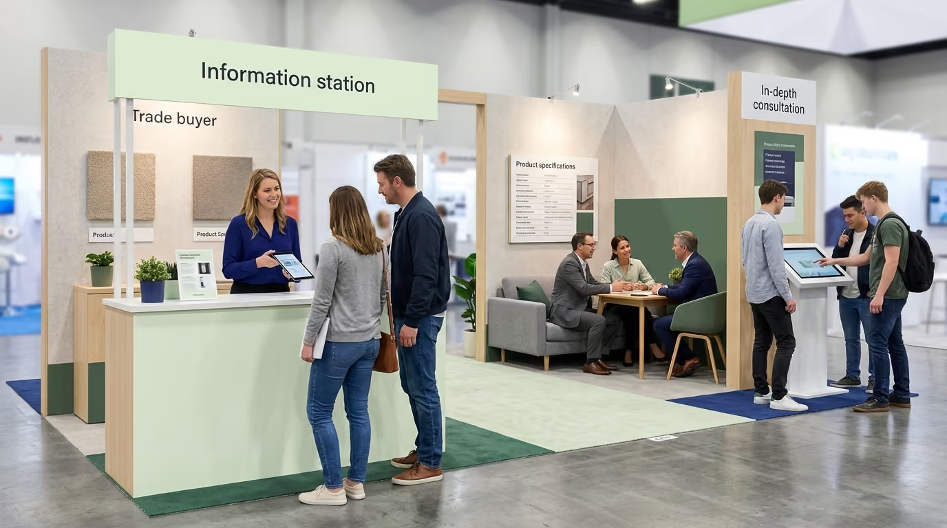
The close-range layer supports active engagement once a visitor steps across your booth boundary or begins interacting with floor staff. At this distance, the visitor seeks technical validation, operational depth, and clear guidance on next steps.
Close-range surfaces include interactive touchscreen kiosks, counter graphics, structural product podiums, pull-up spec banners, and diagnostic demo panels. This layer accommodates technical specifications, architecture diagrams, detailed case study summaries, and interactive quick-response triggers. By keeping this granular data inside the booth interior, your perimeter remains clean, focused, and visually commanding.
When our team coordinates multi-market exhibits, we see that booths respecting this three-zone separation capture significantly more qualified foot traffic. You can explore our framework for planning a high-performance trade show activation to see how physical spatial zones integrate with floor workflows.
Typography on an exhibition floor operates under extreme physical constraints. Reading angles are rarely straight, distances vary continuously, and lighting is inconsistent across different halls. Designing legible signage requires strict adherence to typographic scaling ratios, stroke weights, and surface reflectivity standards.
Sans-serif typefaces represent the industry benchmark for large-format event wayfinding and identity signage. Accessibility Standards Canada explicitly mandates sans-serif lettering for primary informational and wayfinding signage due to its superior character definition at extreme angles.
Select type families engineered with large x-heights, open internal counters, and distinct character geometries. Avoid ultra-thin or ultra-bold font weights for critical messages. Thin strokes disintegrate under bright halogen lighting, while heavy black weights bleed together when viewed at a distance. Avoid setting body copy or secondary headlines in all-capital letters. Mixed-case formatting provides varied word shapes, which the human brain processes substantially faster during rapid aisle scanning.
Determining correct character sizing requires calculating the maximum intended viewing distance. A proven planning baseline across commercial environments is one inch of letter height for every ten feet of viewing distance. High-priority messaging should scale up to three inches of character height per ten feet to maintain legibility in crowded halls.
To apply this across your booth architecture:
Visual contrast dictates whether a properly scaled headline can be processed against its background substrate. Digital accessibility benchmarks from the World Wide Web Consortium (W3C) Web Content Accessibility Guidelines (WCAG) 2.2 provide an outstanding baseline for physical graphic design. WCAG 2.2 establishes a minimum contrast ratio of 4.5:1 for standard text and 3:1 for large-scale text. Furthermore, WCAG requires a 3:1 contrast ratio for essential non-text graphical elements such as wayfinding arrows, interface icons, and data charts.
Applying these contrast benchmarks prevents common aesthetic mistakes, such as placing light grey typography on white acrylic panels or dark navy copy over rich photography. Always place a solid, high-contrast overlay behind text blocks when positioning copy across lifestyle or product photography.
Substrate finish is equally critical. High-gloss vinyl and polished metallic laminates reflect ambient exhibition lighting, creating intense glare spots that blind passing readers. Specify matte, satin, or tension-fabric dye-sublimation materials for all informational surfaces. Tension-fabric graphics absorb ambient hall glare, diffuse internal LED edge-lighting evenly, and maintain consistent color saturation across wide viewing angles.
Trade show graphics are public commercial advertisements subject to federal regulatory oversight. Every headline, comparative claim, and performance metric displayed on your exhibit structure must be fully substantiated before your team uncrates the graphics on site.
The Federal Trade Commission (FTC) enforces strict advertising substantiation policies governing objective product claims. Under FTC regulations, an exhibitor must possess a reasonable basis for all express and implied claims prior to disseminating promotional materials. In the physical realm of trade show marketing, this means that claiming your platform is the fastest, most secure, or lowest-cost solution requires documented validation on file.
The FTC requires competent and reliable scientific evidence for all health, safety, technical efficacy, and comparative performance assertions. The commission defines this standard as tests, analyses, research, or studies conducted by qualified experts using objective, scientifically accepted procedures. Superlative phrasing such as "the industry standard," "proven 100% reliable," or "guaranteed carbon-neutral" cannot be deployed as harmless marketing puffery. If your signage asserts an objective performance outcome, you must maintain empirical proof.
To communicate commercial power while maintaining regulatory compliance, structure your key proof points using a four-part modular framework:
Instead of displaying an unsubstantiated headline like "The World's Most Efficient Cold-Chain Packaging," deploy a structured claim module:
This level of precision separates serious enterprise partners from speculative vendors. It builds immediate credibility with sophisticated commercial buyers, category managers, and enterprise procurement directors.
Spatial disorientation kills booth engagement. When attendees step into an exhibit without obvious navigation cues, they feel uncomfortable and quickly exit back into the aisle. Effective graphic systems act as an intuitive navigational roadmap, directing visitors smoothly from curiosity to commercial qualification.
Wayfinding principles developed by accessibility authorities, including Wollongong City Council event frameworks, demonstrate that directional guidance must appear directly at physical decision points. In an exhibit environment, these decision points occur at the aisle entrance, the perimeter demo boundaries, the queue thresholds, and the private meeting room vestibules.
Directional indicators should combine plain-language text, universal pictograms, and directional arrows positioned well above crowd shoulder height. Color-coding individual booth zones can assist spatial orientation, but color must never serve as the sole navigational indicator. Pair color treatments with structural iconography, high-contrast borders, and clear typographic labels to ensure universal accessibility.
A comprehensive exhibit wayfinding system deploys purpose-built signage modules across the physical floor plan:
When structuring these functional zones, integrate proven trade show lead capture and data quality strategies into the physical graphic layout. Doing so ensures visitors naturally encounter lead capture touchpoints as they navigate the space.
A trade show booth does not exist in isolation. It is a physical gateway within a broader enterprise sales cycle. Your on-site graphics must synchronize perfectly with interactive touchscreens, mobile engagement flows, pre-event marketing campaigns, and post-show sales follow-up materials.
When an attendee reads a value proposition on your fabric backwall, scans a quick-response code on a product pedestal, and receives an automated follow-up email, the core messaging must match across every surface. Fractured nomenclature creates friction and erodes trust.
Maintain identical product naming conventions, metric structures, and visual brand assets across every channel:
This messaging alignment reinforces brand positioning and accelerates enterprise deal velocity.
Quick-response codes are powerful conversion triggers when deployed with operational discipline. However, placing a bare, unlabelled matrix code on a wall panel yields poor engagement. Attendees will not scan an unexplained graphic that forces them to guess the digital destination.
Every physical quick-response deployment must satisfy six technical and structural rules:
Digital LED walls and commercial flat-panel displays serve as dynamic visual extensions of your graphic architecture. Avoid looping generic corporate sizzle reels filled with rapid transitions, uncaptioned dialogue, and marketing fluff. Most convention centers enforce strict audio volume limits, rendering uncaptioned video content completely useless.
Design all digital video loops to be 100% understandable with the audio muted. Use large, high-contrast open captions, prominent motion titles, and a consistent three-second visual cadence. Treat the first frame of your video loop like a static long-range headline so the screen communicates commercial value even if an attendee glances at it for a fraction of a second. When planning larger dynamic environments, review our guide on turning trade show chaos into qualified pipeline to master digital floor interaction.
Flawless booth graphic execution requires military-grade operational discipline. Even the most compelling creative concepts will fail if production files lack proper bleed margins, substrates warp under venue humidity, or freight handlers crush delicate framing extrusions.
A leading enterprise natural food brand preparing for a major commercial expansion across national grocery chains needed to overhaul its trade show presence. The brand occupied a prominent 20x20 island space at a primary national food and beverage trade show. Historically, their booth graphics relied on generic lifestyle photography, complex ingredient provenance paragraphs, and low-contrast pastel branding that blended into the surrounding convention hall.
The commercial objective was straightforward: attract high-volume retail buyers, category managers, and national distributor executives, validate cold-chain product reliability, and secure scheduled merchandising review meetings. However, the existing graphic footprint suffered from severe operational issues:
Our team transformed the brand's physical presence by executing a rigorous, three-zone communication architecture:
By aligning graphic hierarchy with the commercial needs of retail buyers, the brand transformed its exhibit efficiency:
For teams looking to connect exhibit presentations to retail distribution expansion, explore our analysis on designing trade show booths for retail buyer meetings.
Measuring the commercial impact of your trade show signage requires looking beyond subjective creative opinions. Marketing leaders must evaluate graphics as a functional component of their demand-generation and enterprise sales infrastructure. Calculating your true Return on Investment (ROI) requires tracking both leading indicators of floor engagement and lagging indicators of commercial pipeline conversion.
Research and performance benchmarking frameworks from the Center for Exhibition Industry Research (CEIR) show that top-performing exhibitors measure performance across every stage of the attendee interaction funnel. By treating signage as a conversion mechanism, you can establish clear diagnostic benchmarks.
Leading metrics capture how effectively your graphic hierarchy halts qualified foot traffic, sparks interest, and drives initial interaction:
Lagging metrics demonstrate whether clear visual communication translates into tangible enterprise pipeline and closed revenue:
Conduct a rigorous post-show post-mortem with your floor staff and sales operators. Review these diagnostic questions:
Systematically documenting these insights ensures that every future trade show deployment compounds your commercial efficiency, shortens your sales cycles, and maximizes your event marketing return.
A trade show backwall headline should contain between four and eight words. It must communicate your core commercial outcome or product category in plain language that can be read and understood in under three seconds from a distance of twenty feet. Supporting points should be split into distinct, scannable visual modules rather than multi-line sentences.
The optimal mounting height for quick-response codes is between 48 and 60 inches from the finished floor. This places the visual trigger within natural eye and hand level for most adults, accommodates wheelchair users, and prevents camera distortion caused by scanning at steep upward or downward angles.
Large-format vector artwork, including typography, logos, and layout lines, should always remain in native vector format. For raster photographic assets, files should be built at a minimum resolution of 100 to 150 dots per inch at 100% full print scale, or 300 to 400 dots per inch if designing at quarter scale.
Place essential high-level qualification copy directly beneath the relevant claim in clear 18-point or 24-point type, ensuring strong contrast against the substrate. For extensive regulatory disclosures, methodology descriptions, or clinical study notes, incorporate a dedicated, scannable quick-response code linking directly to the complete digital compliance documentation.

30 Years Experiential & Retail Activation Partner for CPG & Beverage Brands | Multi-Market Demos, Roadshows & Costco/Club Programs That Actually Sell