Robbie Thain
Founder, CEO
Master trade show booth strategy with practical tips on visual hierarchy, layout, and signage to convert aisle traffic into qualified retail leads.
Trade show booth design is not about making a pretty backdrop. The true objective is engineering a high-conversion environment that turns aisle traffic into qualified leads. By mastering visual hierarchy, smart layouts, and consistent messaging, marketing leaders can reliably transform brief floor interactions into measurable revenue.
Walk into a typical convention center at ten in the morning on day one. The aisles are crowded with distracted buyers, competing vendors yell over each other, and your team scans the crowd for eye contact. You invested heavily in your floor space, yet most attendees walk right past your expensive setup. They glance at your signage, fail to understand your core offer in three seconds, and keep moving.
This chaotic environment is the reality of live event marketing. Poor physical design actively works against your sales team by confusing potential buyers. Attendees move quickly, and they judge your credibility instantly based on visual cues. They notice staffing behavior, and they assess whether the space feels organized and credible.
The financial stakes for these events are incredibly high. Companies spend massive portions of their annual marketing budget on booth space, shipping, travel, and staffing. When that investment fails to produce qualified leads, the entire marketing department faces intense scrutiny from leadership. You cannot afford to lose a major retail buyer simply from bad signage.
According to the Center for Exhibition Industry Research, 84 percent of attendees have buying influence. That means a confusing layout directly damages your Return on Investment. We see this often when brands treat their space like a decorative storage unit instead of an active sales channel. To fix this problem, you need a methodical system that forces attendees to stop, look, and engage.
If your setup looks messy, buyers will assume your product operations are equally chaotic. Every person walking past your invisible display represents lost pipeline. We specialize in creating retail demos, product sampling programs, and roadshows that bring brands face to face with their audiences. We know exactly what happens when physical design fails to match the quality of the product.
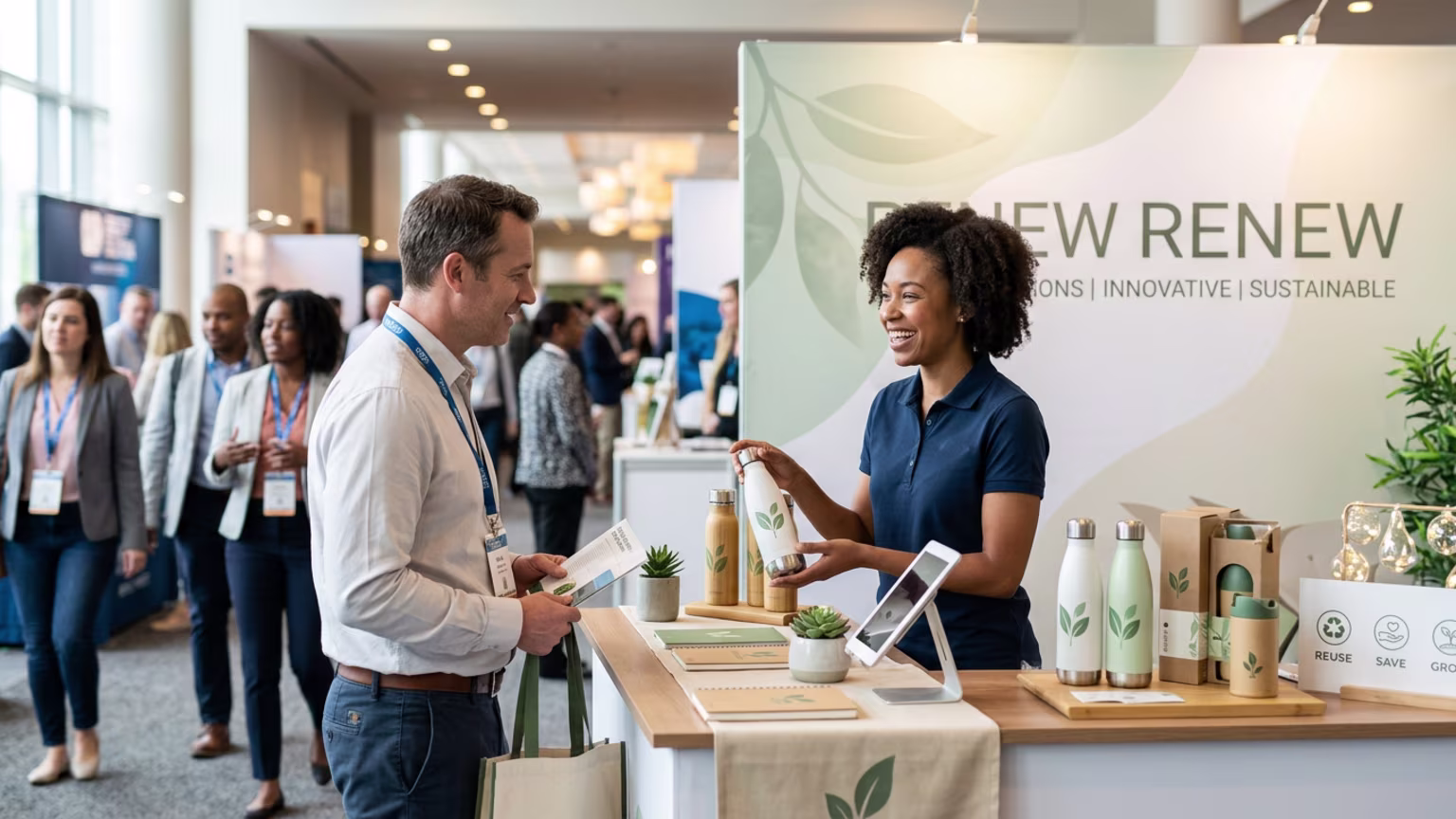
The foundation of a successful booth relies on clear attention architecture. You must design for the human eye, prioritizing rapid comprehension over complex storytelling. In our experience, the best setups answer three questions instantly. Buyers need to know who you are, what you sell, and why they should care.
Understanding the psychology of visual scanning is your first step toward better results. Human beings naturally look for contrast, symmetry, and clear boundaries when navigating complex environments. By utilizing high-contrast colors and large fonts, you help the brain process your information with zero effort. The goal is to make stopping at your booth the path of least resistance.
According to signage guidance from Sign Art Graphix, event messaging must be short, simple, and readable from a distance. If your banners feature long paragraphs, you are already losing the attention war. You must establish a unified visual system across every single touchpoint. This means your overhead banners, backdrops, counter graphics, and staff attire all share the exact same color palette and typography.
When you create trade show experiences that drive real business, consistency becomes your best asset. The Tradeshow Network advises against treating a large footprint as two separate spaces. This fragments the brand presence and confuses the buyer. Instead, use seamless graphics and modular framing to build one cohesive environment.
Visual height plays a massive role in pulling traffic toward your location. Research from Cardinal Expo shows that hanging trade show banners provide unmatched visibility across the hall. Maximizing your vertical real estate helps you compete above the eye-level clutter. Overhead signs act as powerful markers that guide attendees to your booth from multiple aisles away.
Knowing the theory is useless without a rigorous plan for show day. Your team needs a specific set of actions to maximize the physical space and capture attention. Follow this exact sequence to turn your structural design into a living, breathing sales machine. This tactical approach separates the top performers from the rest of the pack.
Keep your main headline under ten words to maximize impact. Visitors scan your booth in passing, meaning you must communicate the primary value proposition immediately. A major design trend is moving toward fewer words and much more clarity. Brands are increasingly using one key promise and one product hero visual to win attention.
Remove barriers like tables or heavy counters from the front corners. An open flow invites traffic inward and creates obvious entry points for conversations. Proper flow prevents awkward traffic jams and gives your staff plenty of room to work. Look at booth traffic blueprints that scale to pop-up roadshows to keep your floor dynamic.
Align your team attire with the primary booth color scheme. Cohesive branding extends to the people running the space, making the entire setup look highly professional. If your hanging banner says one thing and your staff present a different image, the attendee experiences severe fragmentation. A unified look builds immediate trust with serious buyers.
Assign dedicated areas for quick qualification, deep product demonstrations, and private meetings. This structure prevents bottlenecks and keeps attendees moving logically through the experience. Clean materials, organized presentation, and readable claims help you build trust rapidly. This matters immensely for first-time brands trying to win retailer confidence.
Do not force attendees to fill out long paper forms on a clipboard. Attach a clear call to action to a scannable code right on the sampling counter. Make sure the digital landing page matches the physical booth design perfectly to maintain high trust. This frictionless transition from the real world to your digital pipeline is what modern buyers expect.
Avoid handing out cheap plastic items that end up in the hotel trash. Show Your Logo recommends offering practical, eco-friendly items like drinkware or totes to extend brand exposure. The right takeaway is a long-tail touchpoint that keeps your logo on a desk for months. Select giveaways that align perfectly with your corporate values.
Measuring the impact of your physical design requires tracking specific performance indicators. You cannot rely on raw badge scans alone, as they tell you nothing about engagement quality. Instead, you need a mix of leading and lagging metrics to prove your space actually worked. This data proves the true value of your structural investments.
To validate your strategy, monitor key metrics that prove trade show success beyond foot traffic. Start with your aisle stop rate, which measures the percentage of passing attendees who actually pause. If this leading metric is low, your signage or layout is failing to grab attention. Next, track your dwell time to see how long people remain inside the footprint.
Longer dwell times indicate your layout is comfortable and your messaging resonates with the audience. Move on to track your demo completion rate, showing how many visitors stayed for a full product walkthrough. For a lagging metric, track your sample-to-follow-up conversion rate over the next ninety days. This proves whether those fast interactions turned into scheduled sales calls or active retail pipeline.
Connecting physical design to your Customer Relationship Management software is the ultimate target. Every badge scan should trigger an automated sequence tailored to the exact product demo the visitor experienced. When your follow-up matches the physical branding, you reinforce the memory of that positive floor interaction. This closed-loop system is how top marketing operators prove their value to the executive board.
Modern setups are built to generate photo moments and social amplification. Cardinal Expo notes that branded backdrops combined with hanging signs increase visibility on the floor and online. You can track this by measuring the number of social posts generated directly from the event. By documenting these data points, you build a concrete case for future marketing budgets.
Applying these principles in the food and beverage sector reveals how much physical design dictates success. Our team recently supported a premium snack brand launching a new product line at a national expo. They previously struggled with crowded, text-heavy backdrops that confused buyers and blocked entryways. Their sales team felt entirely defeated by the poor floor traffic.
We overhauled their approach by applying a strict visual hierarchy and simplifying their core message. We removed the bulky front tables, opened the corners, and installed an overhead locator sign. The staff were trained to stand near the open edges, offering samples and matching the booth aesthetics perfectly. Everything operated as one unified system designed to reduce buyer friction.
The buyer conversations shifted from basic product education to deep discussions about retail velocity and distribution logistics. By answering the basic questions with smart signage, the human staff were free to do high-level sales work. The brand walked away from the expo with commitments from three major national grocery chains. This transformation highlights the power of aligning operational discipline with striking visual design.
The results were immediate and highly measurable. Aisle stop rates doubled on the first day, and the open layout allowed the team to process triple the product samples. The clear messaging filtered out unqualified visitors, leading to a massive spike in scheduled buyer meetings. This proves intentional design is not merely decorative; it is a highly critical sales tool.
After the event, the team used a structured post trade show debrief for planning roadshows that convert sales. They took the exact same messaging system and scaled it down for a regional mobile tour. This created brand continuity across all their live marketing channels. If you are ready to stop wasting budget on confusing event setups, it is time to act. Book a strategy call today to fix your execution process.

30 Years Experiential & Retail Activation Partner for CPG & Beverage Brands | Multi-Market Demos, Roadshows & Costco/Club Programs That Actually Sell

Since 1995, Makai has been connecting brands with people through live experiences, retail programs, and national activations.


